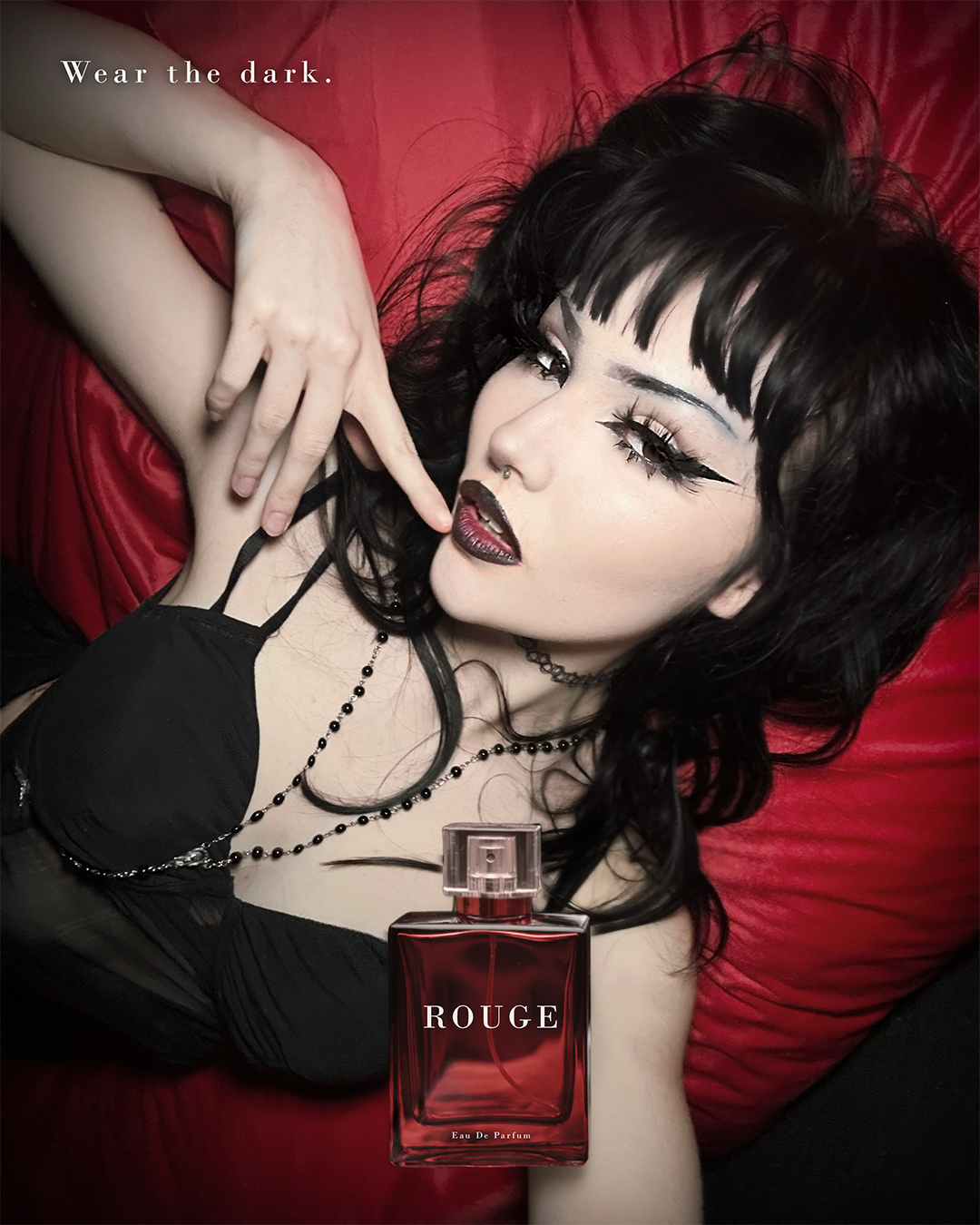
Case Study — Spec Brand

ROUGE

Dark alternative feminine. Dangerous red, not romantic red.

Category

Luxury Fragrance

Deliverables

Editorial · Product Static · Motion

Tools

Photoshop · After Effects

Pieces

3 total

Aesthetic

Dark Alternative Feminine

Palette

Deep Crimson — Near Black — Silver

Typography

Bodoni — Full Caps — Wide Tracking

Reference

Urban Decay · Juliette Has a Gun

Creative Work
ROUGE Hero Ad — Wear the Dark

01

Rouge — Editorial Composite

Wear the Dark.
Hero Ad

Editorial Composite Static Ad Meta Feed 1080×1350

Model on deep red satin with the ROUGE bottle composited at the base of the frame. Bodoni copy at wide tracking in the upper left. The image was colour graded to compress the shadows and push the crimson tones to the edge — the contrast between the dark figure and the glowing satin surface does the selling. Photoshop.
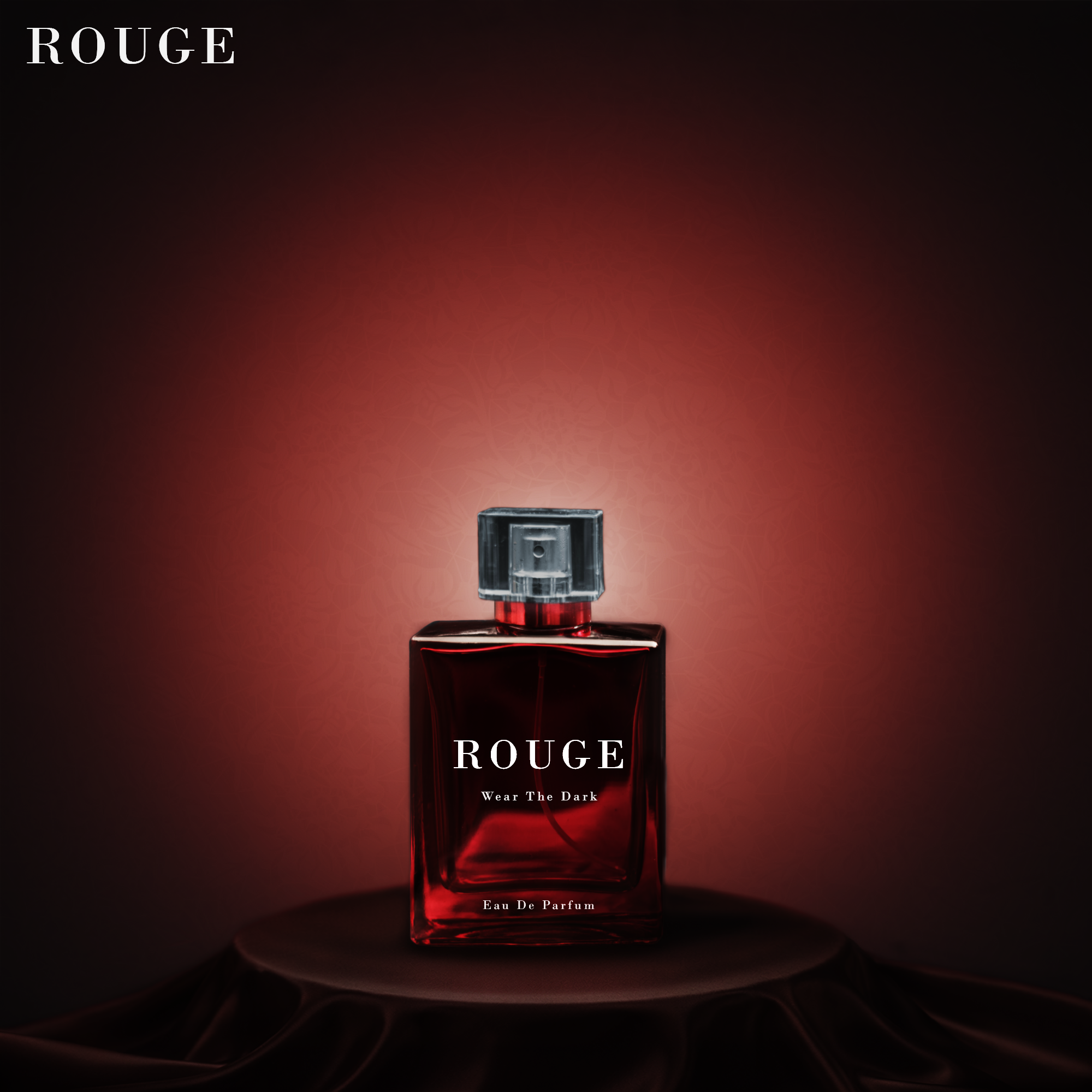
ROUGE Bottle Static

02

Rouge — Product Static

Bottle Static.
Product Ad

Product Static Lighting Composite Meta Feed 1080×1080

Bottle on dark satin with a near-black background. The cap was desaturated and darkened to recede into the composition — the bottle label becomes the focal point. Colour world pulled from the same crimson palette as the hero ad to keep the campaign cohesive. Photoshop.

03

Rouge — Motion

Ghost Text Reveal.
Brand Film

After Effects Motion Graphics Brand Film

The ROUGE wordmark materialises through a wispy, organic dissolve. The reveal feels less like an animation and more like something emerging from darkness. Built in After Effects.

Brand Identity

Creative Direction

Dark alternative feminine energy. Urban Decay, Juliette Has a Gun, Vivienne Westwood adjacency. Fashion-forward, not mainstream. Dark without being Gothic. The woman who wears ROUGE is not trying to be liked.

Typography & Tone

Bodoni in full caps at 400–600 tracking. White at 85–90% opacity. Copy is declarative, not descriptive — "Wear the Dark." is a command, not a tagline. No softness, no warmth in the language.

Colour & Atmosphere

Deep crimson #8B0000 — Near black #080808 — Silver hardware accents. Dangerous red, not romantic red. The palette should feel like a bruise at midnight, not a valentine.

Work With Me

Ready to make
your brand unforgettable?

I take on a limited number of retainer clients each month. If you’re serious about your creative, let’s talk.

Start a Conversation Book a Discovery Call