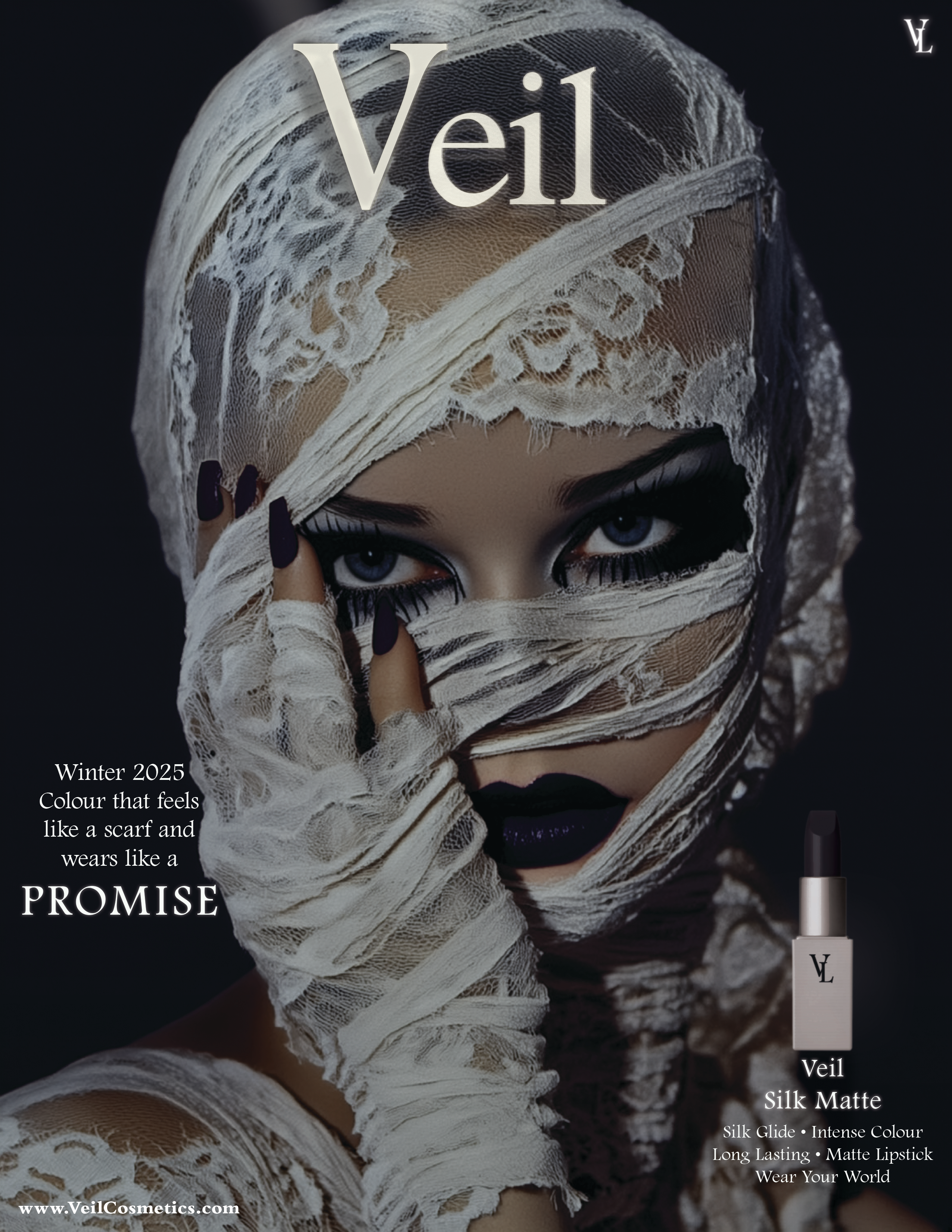
Case Study — Spec Brand

VEIL

Premium dark fashion. Quiet luxury with an edge.

Category

Fashion & Apparel

Deliverables

Editorial · Product Static · Motion

Tools

Photoshop · After Effects

Pieces

3 total

Aesthetic

Dark Minimalism

Palette

Near Black — Ivory — Deep Violet

Typography

Thin Grotesque — Lowercase — Wide Leading

Reference

The Row · Celine · Toteme

Creative Work
VEIL Magazine Cover

01

Veil — Editorial Composite

Magazine Cover.
Editorial

Editorial CompositeStatic AdMeta Feed 1080×1350

Full magazine cover concept built as a paid social creative. Typographic masthead, high-contrast model shot, and product placement in the lower frame. The premise: what if a luxury fashion editorial ran as a Meta ad without changing a single element? Dark palette, deep violet background, no concessions to "ad format" conventions.
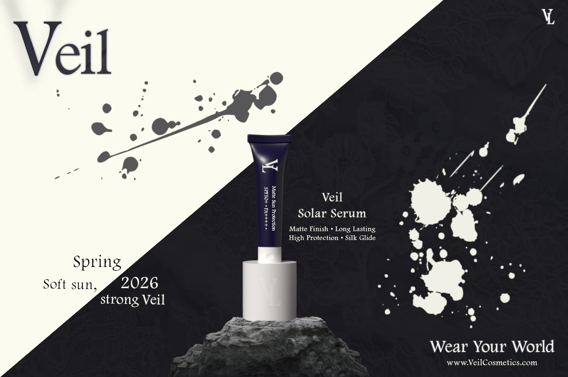
VEIL Spring Launch

02

Veil — Product Static

Spring Launch.
Campaign Ad

Product StaticCampaign AdLandscape Format

Spring collection launch static. Extreme negative space does the heavy lifting — the product earns attention through absence, not noise. Restrained copy, elevated placement, no background clutter. Built for a premium fashion feed where the cost of looking cheap is higher than the cost of saying less.

03

Veil — Motion

Typographic Animation.
Brand Film

After EffectsMotion Graphics16×9 Brand Film

Kinetic typographic sequence revealing the VEIL name through layered fade and position animations. The pacing is deliberate — every beat held a half-second longer than feels comfortable, which is exactly what makes it feel expensive. No visual noise, no transitions for their own sake. Just the word, the weight, and the timing.

Brand Identity

Creative Direction

The Row, Celine, Toteme energy. Quiet luxury — no logos, no noise, no explanation. Fashion for people who already know. The brand communicates through restraint, not declaration.

Typography & Tone

Thin grotesque, generous tracking, lowercase throughout. White on deep ground. Copy is sparse — three words maximum where possible. Typography that breathes, not typography that fills space.

Colour & Atmosphere

Near black #0d0b12 — Dusty ivory — Muted violet accent #9b8db0. Colour as atmosphere, not decoration. The palette should feel like a darkened fitting room in a Paris concept store.

Work With Me

Ready to make
your brand unforgettable?

I take on a limited number of retainer clients each month. If you’re serious about your creative, let’s talk.

Start a Conversation Book a Discovery Call